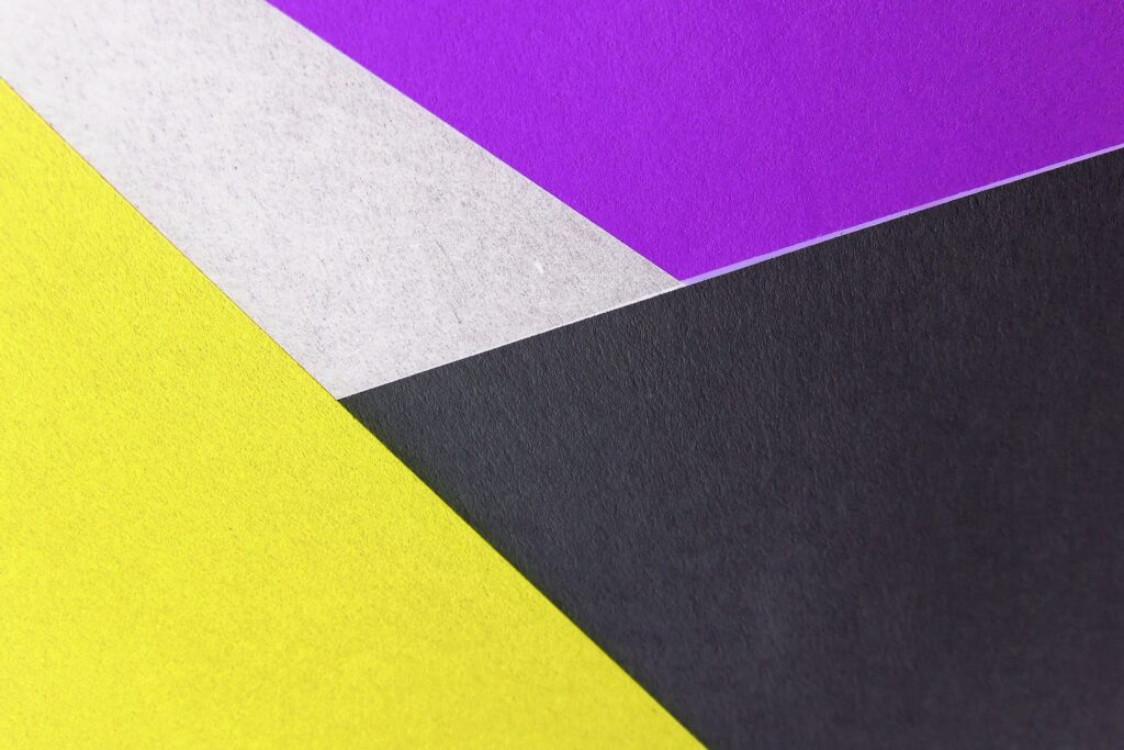
When you first see the word ‘contrast’, you might initially picture two very different colours positioned right next to each other. A classic example would be black and white, but plenty of other potential examples abound; think the red and gold of McDonald’s branding or the pink and yellow of Battenberg cake.
You can probably already see one reason why contrast is a good idea: it’s memorable. However, there are various other reasons for you to consider applying contrast somewhat liberally across web content.
How does contrast often work in graphic design?
Contrast is a key feature of many reputable websites. For example, there’s a contrasting effect when black text is placed on a white background, as you can particularly see on the Apple website.
Contrast doesn’t just have to arise from the use of colour, either. It can happen when you choose a large font size for headings in your articles and a smaller font size for their main text. In this context, contrast can help designers to make certain design aspects more prominent than others.
The fact that a heading of an article uses larger text than, say, the subheadings sends out a message that the heading should be read first. Meanwhile, the subheadings could, in turn, be displayed in a bigger typeface than that of the body copy, thereby assisting in establishing a visual hierarchy.
On a simpler level, though, contrast can simply be about making certain visual components easier to digest. Imagine how arduous it could be for you to try reading black text on a dark grey background. Also, wouldn’t the Coca-Cola logo’s lettering be much harder to read if it was pink rather than white?
How contrast can be creatively used in graphic design
We’ve underlined several basic principles of contrast in graphic design, but none of this is to say that you can’t experiment a bit with how your marketing materials use contrast. After all, another purpose it can serve is making an image more visually distinctive and, as a result, more exciting.
The reason why we say ‘a bit’ here is that, in contrasting an array of aesthetic elements, whether those are letters, words, shapes or colours, you still need to heed other graphic design principles — like those of unity and alignment. Otherwise, your design could just end up looking like a tangled mess.
That could bode ill for your brand identity, as clients will want to see that you essentially practice what you preach. For example, a tailor’s shop that pledges a crisp, clean finish in its suits could struggle to be taken seriously if its logo doesn’t look like it has been crafted just as meticulously.
If you are unsure how you could get contrast ‘just right’ in the design of your company’s own promotional graphics, feel free to contact our digital marketing specialists. We have access to experienced and skilled graphic designers who know how to contrast in a way that won’t lumber your business with an ill-fitting or downright disorganised design framework.