If you are considering revamping your company’s branding and including a new logo as part of the change, you could understandably feel daunted. After all, crafting a logo can feel like a delicate art; many companies have slipped up in the attempt and, as a result, attracted public scorn.
However, it’s reassuring to know that even some of the world’s most loved logos came out of a lengthy and convoluted gestation period, as the following examples show.
Apple
These days, the Apple logo is instantly recognisable due to many reasons – including its simplicity, the “bite” and, of course, the symbol’s prominence on millions of iPhones around the world.
However, the very first Apple logo back in the late 1970s was much different and more elaborate. It portrayed the legend of the English scientist Sir Isaac Newton beneath an apple tree, but was quickly supplanted by the current logo in rainbow colours that eventually went away in the late ’90s.
McDonald’s
In the 1950s, brothers Richard and Maurice McDonald conceived the idea of building their fast food restaurants in arched designs to catch the eye. However, it wasn’t until the following decade that the “golden arches” made it into the company’s logo in the form of a stylised “M”.
Before then, the McDonald’s logo had been a pudgy cartoon chef called Speedee who, it would be fair to say, hasn’t quite had the same lasting cultural impact as Ronald McDonald.
BMW
Contrary to common belief, the BMW logo’s blue-and-white segments were not originally designed to resemble an aircraft propeller’s white blades to the backdrop of a blue sky.
Instead, the colours were chosen due to their associations with Bavaria, the German region where the automobile manufacturer was founded. The blue-and-white colour scheme features in Bavaria’s two official flags which even have royal origins.
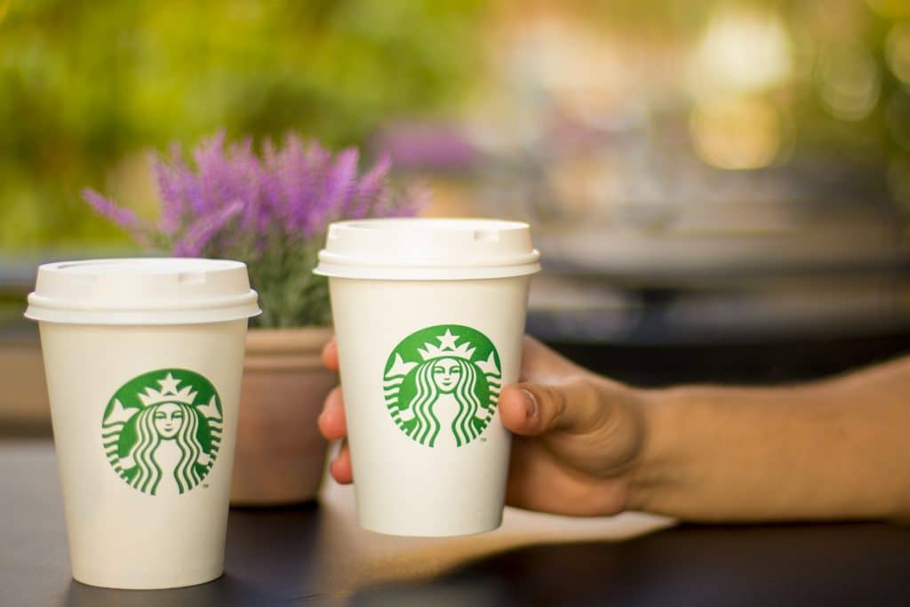
Starbucks
Who is the crowned feminine figure who we keep seeing on the packaging of our Starbucks coffee cups? A spokeswoman for the chain, Valerie O’Neil, clarified the matter in 2006, saying that the logo depicted a “twin-tailed mermaid, or siren as she’s known in Greek mythology”.
The siren used to be shown in her entirety on the Starbucks logo which has since been streamlined to draw more attention to her face. In 2011, even the “Starbucks” lettering was removed, its inclusion having become superfluous owing to the strong iconography of the mermaid image alone.
Metro Goldwyn Mayer
The movie studio’s logo of a roaring iron circled by a ring of film has endured for decades. The logo was created in its earliest form in 1916 for Goldwyn Pictures – which, eight years later, merged with two other companies to form Metro Goldwyn Mayer and essentially took the lion logo with it.
At Webahead Internet, we can make your own company’s branding roar (ahem), as our graphic design services allow for the creation of a logo that can feature on your firm’s website, letterheads and more. Give us a phone call on 01325 582112 to learn how it can be done.