A company’s logo has to satisfy various criteria: it must be eye-catching, symbolise what the company is about and long leave a positive imprint in the memory. Perhaps the long list of must-haves helps to explain why even big brands get rebranding wrong from time to time.
Ideally, though, you don’t want the negative publicity that comes from an ill-advised logo overhaul – so, here are some of the best-known logo fails that you can learn from.
BP
In the year 2000, the oil giant BP – or British Petroleum, as you might remember it once being called – jettisoned its simple, green-and-white shield logo, which had become memorable after decades of use, and replaced it with its current “Helios” logo resembling a green-and-yellow sun.
The sun was intended to represent eco-friendliness, not something which should ever be associated with drilling oil, making this refresh the logo equivalent of Pandora’s box… or Pandora’s oil rig.
Cardiff City FC
While BP at least kept its original colours for its overhauled logo, 2012 saw Cardiff City Football Club drop the predominant blue from its crest for the first time in history, replacing it with… red.
This was problematic, given that the team had been – and were still – officially nicknamed the Bluebirds. The red was meant to reflect the Welsh flag’s dragon – but, as the players now confusingly wore red kits at their stadium as well, the crest and home kits reverted back to mainly blue in 2015.
Gap
There was indeed rather a gap (ahem) between what the American clothing retailer and its fans expected when, in 2010, the brand suddenly changed its familiar blue box logo without warning.
That logo had been in place for twenty years, but was now replaced by the bolded word “Gap” in Helvetica font slightly overlapping a square fading from light to dark blue.
Reacting to sniggers from other designers, Gap claimed that the new logo reveal was simply part of a crowdsourcing process – and, ultimately, restored the original design just six days after it had left.
Kraft
The food and drinks company held onto its redesign for a fair bit longer than Gap – six months, in fact. However, the new logo, unveiled in 2009, was bland, comprising the lowercase text “kraft foods” in the dreaded Tekton font. Move over, Comic Sans…
Even the addition of what vaguely looked like a multicoloured shooting star didn’t make amends, so it’s unsurprising that, after spinning off part of its business as Mondelez, the remaining Kraft Food Group took up a refined version of the original Kraft logo.
Pepsi
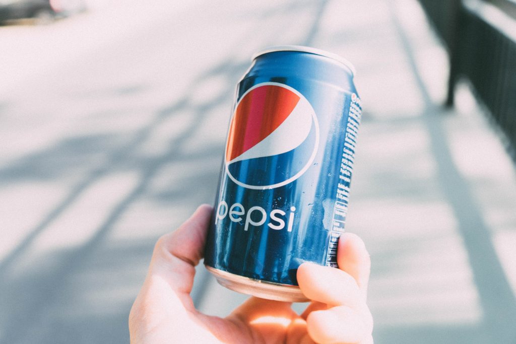
The current Pepsi logo has adorned fizzy drink cans since 2008, but the iconic white stripe doesn’t quite resemble the “smile” that Pepsi has claimed it does. Instead, as observed online, it looks more like the protruding belly of someone who has drunk a little too much Pepsi.
It all sheds light on the importance of hiring expert graphic designers when you see fit to refresh your firm’s own logo.


