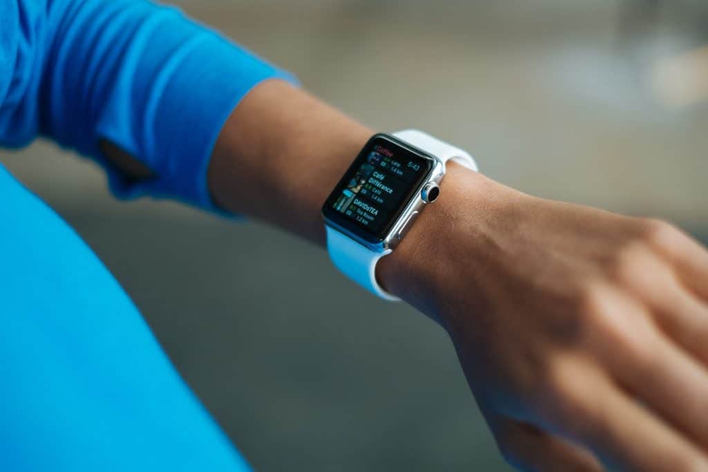
Tech trends, it seems, come and go in a rather cyclical fashion. Back in the 1980s, mobile phones practically resembled bricks, leaving us with a long wait until firms like Nokia learned how to package the tech into sleeker enclosures. Then, the “phablet” age saw mobile devices growing yet again.
However, with wearables increasingly popular and even a relatively small-screened iPhone reportedly on the way, smaller displays look like they could be back in vogue. Can you reach out to people using them? Yes, but you should go about it strategically, as the following points illustrate.
Distil your website’s messages into one concise but strong one
On a smaller screen, your website is obviously getting less real estate, forcing the web user to do a lot more scrolling… if they sufficiently inclined. They might be in a hurry, meaning that what they see of your website by default could ultimately be all they end up seeing.
That’s why, whatever your primary business objective, you should prioritise conveying it perfectly. For example, if you’re currently offering a hefty discount to lure in new customers, you should put that promotion at the forefront, where visitors can easily tap to take advantage, too.
Optimise your content for Google’s featured snippets
What are those snippets exactly? They are little chunks of information that, on Google’s search engine results pages (SERPs), appear even above the organic search results. However, it’s not Google itself, but instead another website, from which the information is sourced.
How do you get some content of your own into that snippet? Basically, if there’s a particular question that your customers often ask you, try dedicating one of your blog posts to answering it. Google will programmatically choose, from third-party websites, what it deems the answer most deserving of inclusion in a snippet set to pop up when the question is entered into the search field.
Why is targeting that prize position so attractive when optimising for small screens? One big reason why is that voice assistants, in response to search queries, often read out information from snippets – including on wearable devices, where the user could struggle to search on Google’s site directly.
Simplify your website’s design, layout and navigation
Of course, when designing your website, you are probably paying little regard to how it would come across on a wearable screen, given how unlikely people are to see it there anyway. However, smaller-screen smartphones can still pose unique challenges for website owners.
The budget-priced “iPhone 9” rumoured for launch this year looks set to feature a 4.7-inch display; even the 5.7-inch display of the iPhone 11 Pro would somewhat dwarf it. Therefore, you may need to shuffle around some elements of your site to accommodate the shrunken display.
You could do that by simply opting for a single-column structure, where clicking a button would send further buttons collapsing down into view. Our expert web designers can provide you with further tips for ensuring that you are not caught out as smart screens rise in popularity.


