If you were to actually Google “colour psychology”, you could be easily misled into thinking that, just by choosing your branding’s hues strategically, you can induce specific emotional responses in your target customers. However, the true picture is much more complex – and controversial – than this.
That’s because, according to research, someone’s response to a certain colour can depend on their own background and experiences as well as the context in which the colour is shown. However, you can still leverage colour’s psychological effect, however subtle it might be in any given case.
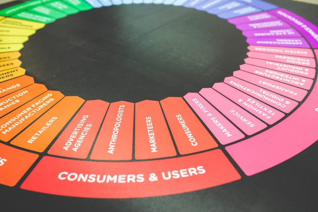
Just how influential is colour?
Frankly, it’s difficult to pin down a concrete answer to this. It doesn’t help that, when many online articles touch on colour psychology, they often descend into sweeping generalisations like “yellow evokes warmth and optimism” and “red can make people excited, but also angry”.
Be careful not to treat such generalisations as much more than that – generalisations. Of course, we all have our own favourite colour, and your upbringing and culture can also affect how you respond to a particular hue, research shows.
Does this mean that you should largely disregard colour psychology altogether as you put together the visual branding to be splashed around your website, posters, flyers and other publicity materials? Not quite, as the right colour can add just the flourish that you need.
Colour does influence buying behaviour
One study, titled Impact of Colour in Marketing, found that as many as 90% of snap judgments made about products can be due to the product’s colour alone. However, other research suggests that the colours you choose for your branding should be appropriate to the specific brand.
It’s probably no coincidence that the Harley-Davidson logo, for example, combines black and orange. The former fits the rugged image of the brand’s motorcycles, while orange is often said to symbolise energy – and you’d be showing a lot of that on a Harley-Davidson motorcycle!
Meanwhile, fast-food giants like McDonald’s and KFC often use red, a colour with the attributed ability to increase the heart rate and so kick-start digestion. Such brands have become so strongly associated with the colour red that changing it now could risk disconnecting with the customer base.
Be wary of simply doing what your competitors are doing
A strong incentive for those fast-food chains to stick with their signature red branding is that we are often drawn towards recognisable brands. However, if your business is new to its industry, you should aim for colours that would differentiate it from established competitors.
Through doing this, you can help your brand to stand out, according to Colour Research & Application. Therefore, you can encourage potential customers to judge your company on its own merits. Still, make sure the colour feels relevant to your industry or the specific product you offer.
Fortunately, our web designers and graphic designers can account for all of this as they work on your campaign, once you have told us your business objectives over the phone on 01325 582112.