Some website designs just show their age straight away. Marvel Studios even parodied this when they promoted their Captain Marvel film with a website that, resplendent in garish animated text and even a view counter, was designed to look as though it originated in the film’s 1990s setting.
If your company’s site struggles to convert visits into sales, then closely study the site itself. Its outdated look could be putting people off, but adding the following elements would be very 2019.
Bold typography and colour
If you want to revamp your website as part of an extensive rebranding exercise that will permeate through the rest of your business, you could try being adventurous with colour.
This can work especially well in the fashion world, where companies can be eager to make a statement in more ways than one! If you stock clothes that are punchy in colour and typography, for example, you could spread that look to your printed publicity materials and, yes, your website.
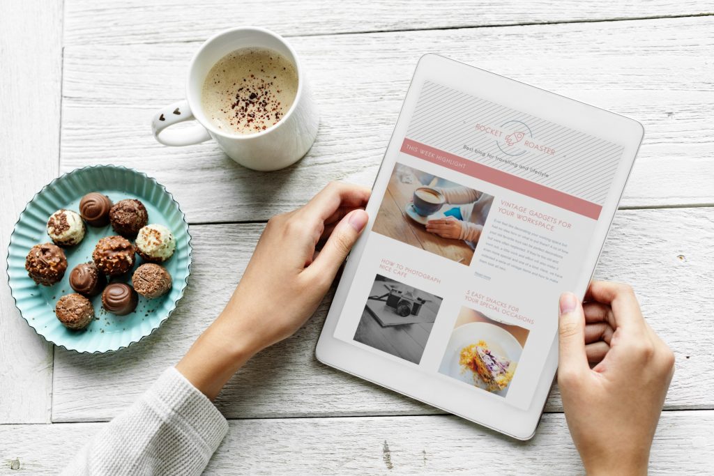
Erratic layouts
Often, graphic designers produce sleek and visually attractive layouts by using what is known as a “grid”. The grid is the bare bones of a design, you could say, as it is from the intersecting horizontal and vertical lines of this grid that the “flesh” of the overall design will hang.
However, this year, web designers have been jettisoning the grid approach in favour of relatively experimental and asymmetrical layouts, which can have interesting implications for the designs.
Outlined typography
Last year, you probably saw a lot of websites adopt large, bold headlines that, though not exactly out of fashion just yet, don’t scream “2019” quite as strongly as outlined typography. This approach can strike just the right balance of attracting attention without feeling excessively overbearing.
There’s interesting scope for experimentation with it, too; consider, for example, using outlined text as an accent to solid-coloured text you place elsewhere on the website.
CSS animations
Seeing the retro Captain Marvel website has probably reminded you that animations have a long – and, if we’re honest, not always proud – history on websites. Thankfully, though, many web designers now use animations in an impressively artful fashion.
In 2019, CSS-generated animations – like the barrel-rolling text used by Spotify on its “Your 2018 Unwrapped” microsite – have taken off, increasingly supplanting traditional GIF-based animations.
Custom illustrations and icons
There have probably been more than a few occasions when you’ve visited a particular website and thought, “Have I seen those photos before?” Stock photography can indeed be commonplace on various sites, not to mention be horrendously boring.
Stock icons and illustrations can repel for the same reason, so it’s heartening to see more and more websites use custom illustrations and icons in their place.
Perhaps you would like one of our graphic designers to simply add your own spin to a familiar icon or go wild with full-scale illustrations for your site? The options are plentiful, so why not dial our web design agency on 01325 582112 to learn more about them?